ui engineering
W3C’s design-system update makes markup part of the system
W3C’s design-system update shows how type tokens, smaller baselines, and semantic markup can make a system easier to evolve.
Published 2026-10-26
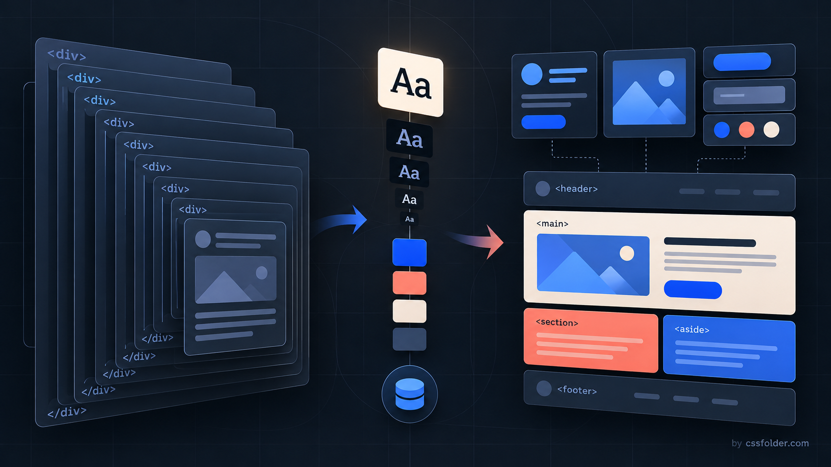
A design-system release can look like a visual refresh while actually changing where a product’s complexity lives. W3C’s September 2026 Website Design System update is a useful example. Its changes cover type, spacing, layout, and cards, but the through-line is structural: move rules closer to the semantic content they govern and remove framework shells that only exist to make those rules work.

Typography became a token decision
W3C says the update introduces a 1.125 type scale, smaller headings, and fluid typography. It also defines nine font sizes as CSS custom properties, replacing Sass mixins that previously combined font size and line height. The old classes remain mapped to the new names for backwards compatibility.
That is a practical migration pattern for any established system. Start by describing the intended scale in durable tokens, then make the public names clearer before removing old entry points. A new token layer does not require every component to be rewritten at once. It gives maintainers a shared vocabulary for evaluating whether an old size utility still expresses a real role or merely preserves an implementation detail.
:root {
  --font-size-body: 1rem;
  --font-size-heading: clamp(1.75rem, 1.3rem + 2vw, 3rem);
}

.article-title {
  font-size: var(--font-size-heading);
}
The snippet is a migration sketch, not W3C’s implementation. Fluid type needs product-specific limits, line-height, and zoom checks. Its value here is the sequence: establish named values, document their purpose, and test the system at the widths where prose and dense UI compete for space.
Remove wrappers only after moving their jobs
The more consequential W3C change is its markup simplification. Listing templates no longer require a wrapping container around their items; cards handle most styling and spacing themselves. The update also removes a dedicated prose wrapper. Instead of asking content to sit inside a text component that controls space and line length, it applies line-length limits directly to headings, paragraphs, list items, and description lists.
That does not mean every wrapper is bad. A wrapper that creates a layout boundary, establishes a container query, or represents a meaningful region can still be valuable. The warning sign is a wrapper whose only purpose is to repair defaults imposed elsewhere. Before removing one, write down the jobs it performs: spacing, width, grouping, focus containment, or visual decoration. Relocate each legitimate job deliberately, then test the resulting HTML without the shell.
Baseline CSS deserves the same review
W3C also replaced Normalize.css, noting that it has not been updated since 2018. The new baseline is smaller and more modern, and the team uses CSS logical properties where practical. At the same time, it removed a wildcard rule that reset margin and padding on every element and pseudo-element. The former setup offered tight control for CMS templates, but W3C says it became restrictive when the system was used outside that environment.
Treat this as a reminder to inventory baseline rules before carrying them into a new component library. A reset can hide browser differences, but it can also turn normal HTML into a special case that only works inside a prescribed component. Audit the declarations that restore spacing one selector at a time. If they exist mainly because a broad reset erased the browser default, a smaller baseline plus scoped component rules may be easier to maintain.
Plan the update as a sequence, not a replacement
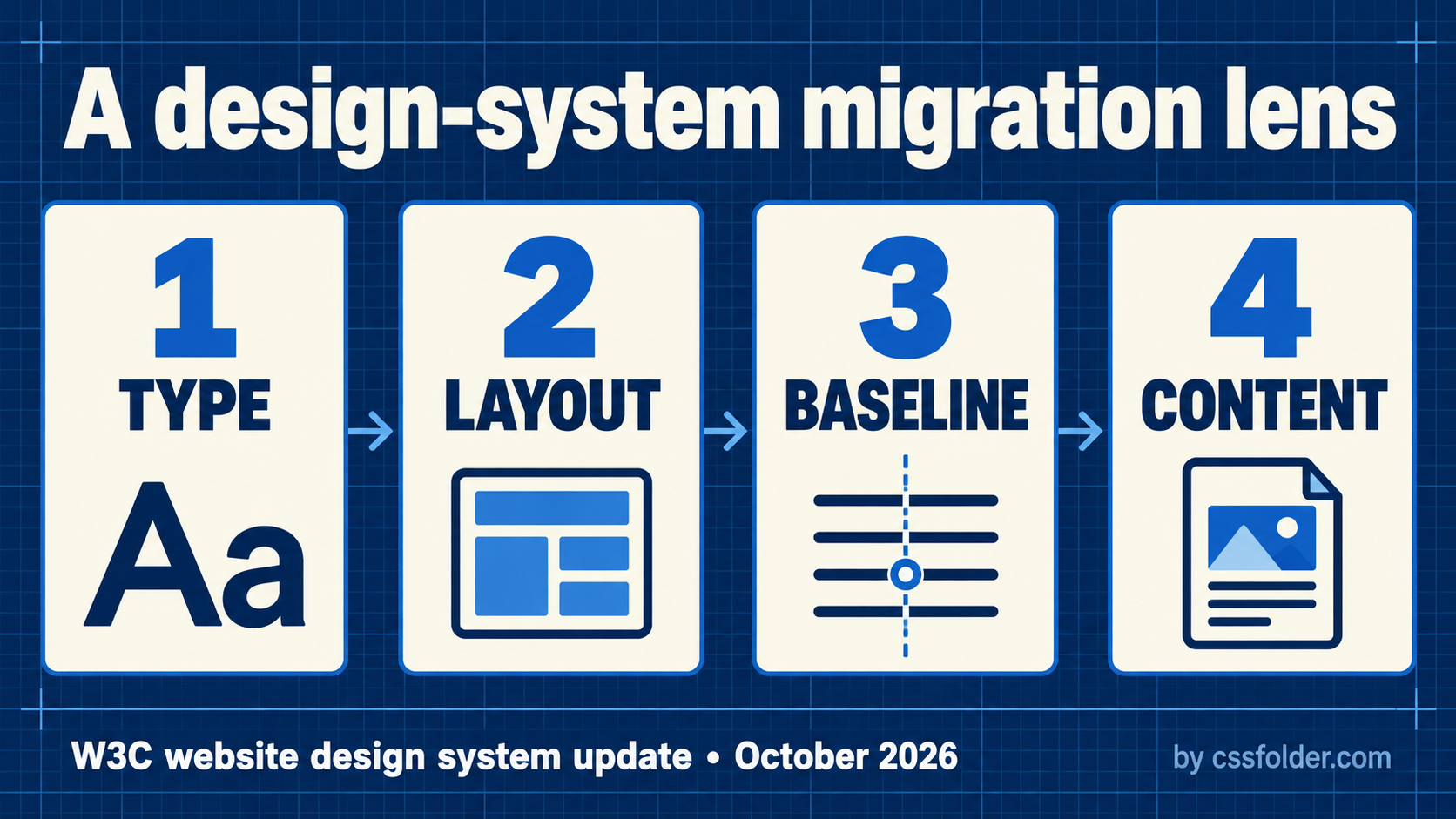
W3C removed the sticky-footer pattern, refactored its pre-footer, added list and table modifiers, and introduced a denser card option. Those are system-specific decisions, not a universal recipe. The transferable lesson is to separate migration layers: token names and type scale first; layout primitives next; baseline and spacing rules after that; component wrappers last. Each layer can be reviewed with an explicit before-and-after page sample.
For a first pass, choose one listing page and one prose-heavy page. Compare their semantic HTML, responsive type, default spacing, and card nesting before changing a global reset. Keep legacy aliases while the new roles settle, and remove them only when real content no longer needs the old wrapper. W3C’s update is useful because it makes the system’s markup choices visible. A design system is not only colors and components; it is also the set of HTML structures a team asks every page to carry.
Source
Primary source: W3C, “What’s new in the W3C Website Design System,” published October 9, 2026. The article documents W3C’s own implementation choices; this CSSFolder article draws migration questions from them and does not treat them as universal requirements.